by Rachel Russell, Graphic Designer
Welcome to the final instalment of the design diaries — following graphic designer Rachel as she develops a new look for Clark Communications. This week, she’s pulling together all the threads as work begins on the new website…

Brief
As with any design project everything starts with a conversation with the client (in this case the Clark management team), to establish what we need the site to do, who its target audience will be and to agree a basic map of the site. I then have a conversation with our web developer who advises me on a suitable platform for the site (in this case WordPress) which will deliver the functionality that we need. High on the list of priorities for the Clark team is having full ownership of our site so that we can constantly update it. We also discuss some styles and structures for the site that might work.
Research
With all this in mind I begin by doing my research. Some of this will already have been covered in my previous branding work and, as before, I want to know just enough about what’s out there to know what our competitors are doing and what the latest developments are without overwhelming myself. This feels especially important in a fast-moving world like website design where technologies and trends are improving and changing constantly.
Wireframing
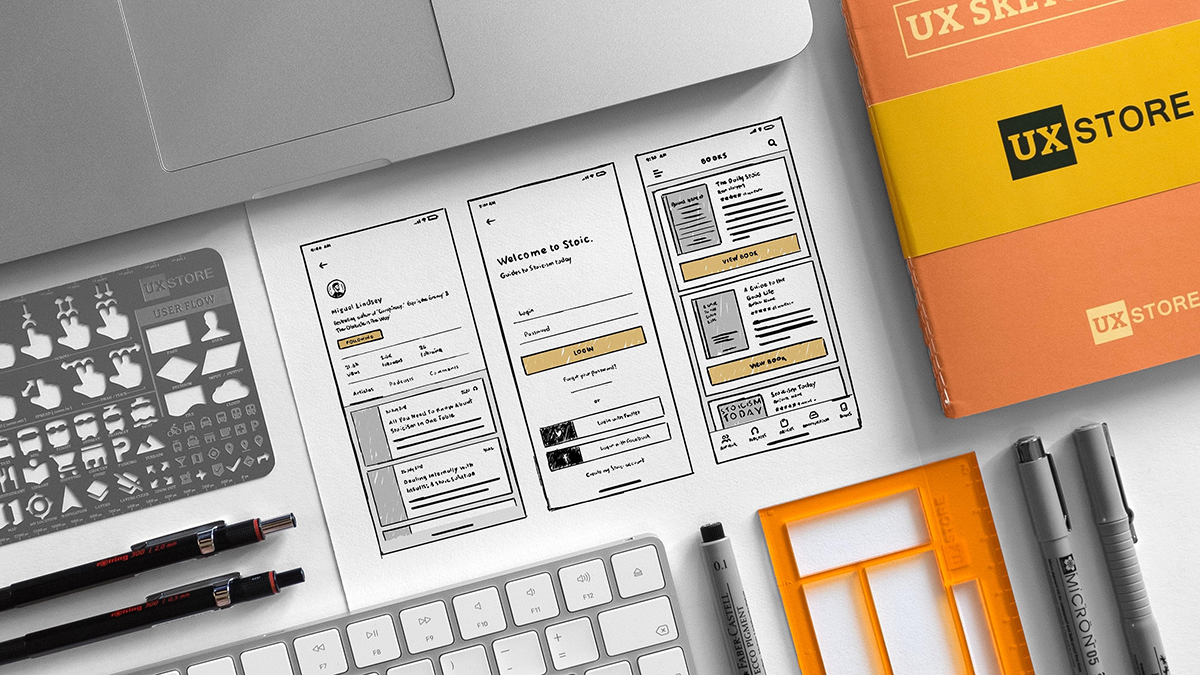
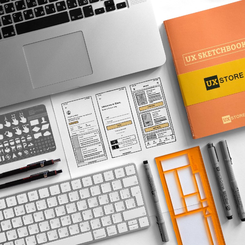
Once I have an idea of the direction I want to go in I start to the plan the structure of the site as a series of wireframes. I begin with pencil and paper as I did for the branding [link to previous post?] and once I have a few ideas to explore I move into Adobe XD. This software allows me to take my rough sketches, create wireframes and then add interaction so that I can show the client and our developer a layout for the site that they can navigate and test. There are no design elements at this stage. This is all about layout, usability and functionality.
Design
Once the wireframe is signed off and I know the structure of the site I can begin designing the look and feel. This is really exciting for me as it brings together all the elements of the branding that I’ve been working on to create a site which clearly communicates who we are as a company. I continue working in Adobe XD and share working models of the site with the management team for review. Our main goal for the design of the website is something modern and clean that gives an immediate feel of what it’s like to work with us.
Development
When the design is signed off XD allows me to easily create style guides for our developer as well as allowing them to download any assets they need to build the site at the touch of a button. Our developer then takes my design for the ‘look and feel’ of the site and creates a responsive website that will look stunning across any platform.
Testing
Once we have a working version of the website we can actually see whether all the design and copy is working well. Is it accessible to everyone? Are visitors to the site clear about what they need to do? Does our creative video content work well and fit in with the rest of the homepage? As well as testing all functionality on the site, any amends will then go back to the developer before the site is ready for launch day!
Our new site and brand is live! Why not check out our previous Design Diaries here and here to learn more about the process.


